12 Steps to Building Successful AEC Proposal Templates
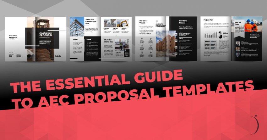
AEC proposal templates streamline each pursuit, helping anyone meet deadlines more efficiently. We have learned some valuable lessons in AEC proposal strategy and development over the last 30 years and have compiled some of that information for your access.
To note: we use Adobe InDesign to create AEC proposal templates; it is a powerful tool created specifically for desktop publishing. However, all our advice can be translated into the program of your choice.
Here is our guide to making a more effective AEC proposal template:
- Get inspiration: When designing the template's look, take the time to research design and branding ideas both within and outside the AEC industry. Within the AEC industry, contact agencies that have had recent proposal selection processes. Reviewing proposals from all different disciplines allows you to understand best practices with AEC industry trends. As for marketing collateral outside the industry, review magazines, brochures, websites, commercials, blogs, books, direct mail, etc. Notice how your eye travels around each page or spread design. What grabs your attention? How does design emphasize the most important points of the piece? What words do you remember from glancing at the article? What message did you receive from a cursory glance?
- Wow them from the start: You get one chance to make a first impression. Ideally, someone “feels” something positive from the first interaction with your proposal. There is a generally a sequence to how your document is perceived. Wow them from the start with a unique and memorable cover design. Photography that is impactful, words that are important, messages that you want to be memorable—all can make your cover stand out.
- Remember your AEC firm’s brand should drive your design: Sometimes we forget, but your company branding standards should drive every decision you make in your layout, words, messaging etc. There are always moments when we want to match our AEC client’s company colors, but in doing so you will lose the distinction of your own brand. You want them to recognize your proposal just by looking at your document.
- Create a coherent and easy-to-follow layout: Choose colors, fonts, and images carefully to create the best page layout. The reader should be able to find the most important words quickly, so keep it clean and professional while providing a clear structure that helps your words leave an impact. Try sketching on paper various options for each page layout. Force yourself to fill out at least 20 thumbnail sketches for a resume or project page layout. Remember bullets, quotes, images, words, and headers are all used to draw the reader’s eye to the most important element. Put yourself in the selection committee’s shoes and observe how your eye travels around the design. Ask a group of coworkers to help test your final design options. Use a previous proposal to help guide you through which elements you could use to improve and enhance your new layout.
- Fonts are important: Proposals can be very text-heavy. Make sure your template font is legible, easy to read, and can be adapted to various RFP regulations. For example, if your corporate font is a condensed version of a font, it will be difficult to easily change to a “generic” font that might be required by an RFP. For example, a 12-pt Times New Roman font takes up a lot more room than a condensed version of a 9-pt font. Making this adjustment to your boilerplate information won’t be an easy fix.
- Use thoughtful graphics: As mentioned above, proposals can be dominated by text. Remember that the selection committee is likely reviewing numerous proposals in addition to yours. The use of AEC-specific infographics will break up text and help the selection committee visualize your key information easier. Graphics that highlight important information is a more compelling way to explain your technical responses.
- Create multiple options for each final template: This is where we get to be creative! Once you narrowed down your final template design, don’t be afraid to create multiple options for each element. Remember that you may need two projects or resumes on one page depending on your RFP page restrictions. Depending on any printing constraints, you may need to have a full-bleed and a border option for each page. Are more photos or fewer photos for each page necessary? Think through 3–5 different layout scenarios for each major element of your template and create those ahead of time so you are not caught off guard in the moment of the deadline.
- Character and Paragraph Styles are your new best friend: They may look intimidating, but character and paragraph styles will save you countless hours in proposal preparation. These styles are a collection of rules that define how your text layout looks and behaves within your document. They contain formatting standards for document characters (fonts, color, scale, etc.) and for paragraphs (indents, alignment hyphenations, spacing, etc.). They can save you time and simplify your work, especially when there are last-minute changes in the proposal process.
- Don’t forget the white space: Make sure you incorporate white space in several areas of the template. Whether it’s your logo, text, images, infographics, tables, or any other element, white space will give your reader a chance to breathe and take in the message.
- Use the InDesign Book feature to assemble your proposal: InDesign’s Book feature can be handy when there are multiple files and/or multiple contributors assisting with a proposal. The Book feature allows all the individual project pages and resumes, firm profile, and management plan sections to be added together through their master page. Any edits made to a master page will automatically alert a change and update in the Book feature. This allows for synchronized page numbers and styles. It generates an automatic table of contents, packages the entire book for print, and creates a single PDF of the whole document. It’s amazing!
- Store information on the artboard: Recently, we have been investing time into organizing clients’ projects pages and resumes into individual folders, applying a new template, updating and writing content, and saving the master document. We have found that there is always more information gathered (s.f., cost, dates, images, quotes, additional scope-specific project descriptions, etc.) than we can use on our master template page. However, we do not want to lose or search for this information when we are in a rush. So, we store additional information in the artboard area of InDesign. This content and imaging are formatted and stored in the right font, paragraph style, resolution, and size for the page. From here, it's easy to drag and drop paragraphs and replace photos.
- Features tell, benefits sell in the AEC industry: Build in places within your template where you are forced to remember to “call out” feature/benefit statements. The most important part of the messaging of a proposal is to focus on benefits, not the features of your firm. If you can read a selling point and say, “So what?”, it is a feature. Selection committee members may not be experts in the AEC industry, so you need to designate areas throughout your proposal to tell them why your features will benefit them as the client and the project as a whole.
Template design is such a fun part of our innovative careers as marketing professionals in the AEC industry. But the reality is that the proposal production process does not lend itself to that creativity in every situation. We need to create a branded experience from proposal to proposal, all within a deadline-driven environment. Use the AEC template development and design process to your advantage and let your creative juices flow.


